What font is used in iOS. What does the San Francisco font look like? San Francisco is not just one font
Your design is approximately 80% text. It is critical for a designer to understand typography in order to choose fonts that will complement the design.
Basics
It is important to understand the terms of font construction in order to separate one font from another and understand the properties of each. First you should understand these terms: ascender line, descender line, baseline, line spacing(leading) and lowercase height (X-height).
Five rules
Most people read texts on the Internet or mobile devices. The five rules of good typography can be applied to both print and digital interfaces. Good fonts make the reading experience enjoyable and encourage a person to read more and effortlessly, so the choice of font should be aimed at maximum convenience.
San Francisco
This is the new default font in iOS, replacing Helvetica Neue. You can download it . This font was created for ease of reading to ensure optimal legibility of the text. It's worth noting that this font was created by Apple. In that video the font is described in more detail.

Depending on the font size, iOS automatically adjusts the letter spacing and switches between Text and Display font options. If the font size is 20 pt or larger, SF UI Display is used, and if the font size is less than 10 pt, SF UI Text is used.
Size
When designing for iOS, your font size should be at least 11 pts to maintain legibility on iPhone, iPad, and Apple Watch. This is the minimum size value, and the ideal is between 15 and 19 pt.

Typeface
When using a modern font like SF, Proxima Nova or Museo, you will find that they have several weight options: Thin, Ultralight, Medium, Semibold, Bold, Heavy and Regular. Font size and style complement each other. It is useful to remember that at 11-19 pt you should use Regular, at 20-34 pt - Medium, and for 34 pt and more - Bold. Light and Ultralight can be used when the font size is very large so that the text can be read, but it is worth remembering that large headings in iOS 11 are usually written in bold.

Line spacing
Ideally, line spacing should be 120-145% of the font size. If it is smaller, the text will look cramped and be difficult to read. When the spacing is the perfect size, each line has its own space and everything becomes easier to read.
Number of characters per line
People read text that is more vertically elongated faster than text that has more characters per line. If a line is too long, the person experiences greater cognitive load as he or she has to focus on each word in the line. To maintain a smooth reading experience, a line should ideally be 45-90 characters long.
Information hierarchy
Hierarchy and interactions should be communicated through your font. Use a large bold font for headings, a gray Medium font of 14-15 pt for signatures. Use less transparency for text that doesn't contain the most important information.

Antiqua and grotesque
The font will be serif or sans serif good choice: It all depends on the type of application. Serif fonts are typically used in applications that contain a lot of text, such as medium, iBooks, Bloomberg, and The New York Times.
Sans serif fonts are used more often because they are more neutral and safe. You'll see them in most apps on the App Store.

Font Resources
Fonts tend to be expensive, but there are several resources where you can download great fonts that will look good in any design.
Google Fonts has a great interface and a good selection of fonts for every possible style. You can download the font files and place them in an Xcode project to use them.

Typekit has a great collection of free and paid fonts that are part of your Adobe Creative Cloud subscription. Some great fonts from the collection are Proxima Nova and Museo.

This is a great service that gives you the opportunity to try fonts for 60 minutes before purchasing them. You can also rent fonts for a fraction of the price to use over a period of time.

Guides
Fonts are, of course, not limited to iOS applications, and the principles should apply to all spaces in which a person needs to read text.
This guide will tell you more about font combinations, apostrophes, quotation marks, parentheses, and more.
A nice tutorial with animated segments that talk about every aspect of typography in a way that will put a smile on your face. I highly recommend it.
Over time, you will want to create hierarchy and contrast in your text by using more than one font. This guide will be useful for selecting font pairs.
If you find a typo, highlight it and press Ctrl + Enter! To contact us you can use .
Helvetica (left), San Francisco(on right)
The San Francisco font has already been used in the Apple Watch, and it has already become the standard font Apple technology: Apple Watch, iPhone, iPad and Mac.

Apple Watch
Apple has used Helvetica as the system font for iOS since its inception. first iPhone. And on Mac OS X they changed the font from Lucida Grande to Helvetica since the release of 10.10 Yosemite. Why did Apple decide to bury Helvetica, the most famous and beloved font in the world?
In small forms Helvetica is weak
They say that Helvetica is not suitable for texts in small font size. When the system font in Mac OS X Yosemite was changed to Helvetica, many designers stated that such a font was not at all appropriate here.

"Helvetica sucks" Erik Spiekermann
When you type text in a small font size, Helvetica's low legibility becomes visible. Helvetica blurs such text. Some texts are mixed and difficult to understand. Many people say that Apple created the San Francisco fonts to make small text on the Apple Watch more readable.

Letters are mixed in small size texts
But today, the resolution of device screens is higher than that of printed materials, and texts in iPhones are not always as small as in the Apple Watch. Why did Apple change the system fonts not only in the Apple Watch, but also in iOS and Mac OS X.
San Francisco is not just one font
San Francisco fonts have many features that make them highly readable. In fact San Francisco fonts for Apple Watch and for iOS/Mac are two fonts with slight differences.
The font family called "SF" is used for iOS/Mac, and "SF Compact" is used for Apple Watch. You can notice the difference in the rounded letters o, e. The SF compact has flatter vertical lines than the SF.

SF and SF Compact
This difference gives texts in SF Compact a larger margin (indentation) between letters, resulting in greater readability on small devices like the Apple Watch.
In addition, the SF and SF Compact fonts are divided into two subfamilies: “Text” and “Display”. This is what Apple calls “Optical Sizes”. “Text” is intended for texts in a smaller size, and “Display” for texts in a larger size.

San Francisco Family
As I mentioned above, when using sans-serif fonts like Helvetica, two adjacent letters “mix”, and letters like “a”, “c”, “s” in a small size look similar.

Display and Text fonts
The “Text” subfamily has more margins than the “Display” subfamily. And the apertures of these text fonts are also wider, so that small point sizes are more legible.
San Francisco fonts are dynamic
One of the great things about San Francisco is how it dynamically optimizes typefaces. The system automatically switches Display/Text font depending on the text size. The threshold value is 20pt.

Designers and specialists no longer need to rack their brains about which font to choose. For example, just add the system font to the UILabel, and the device will select the appropriate style for you.
What strikes me about the San Francisco fonts is the way the colons are displayed. Basically, the colon is placed directly above the line of the font, so it is not vertically centered if it appears between numbers. And in San Francisco fonts, colons are aligned automatically.

Vertically centered colon
San Francisco - Digital Age Font
As you can see, San Francisco fonts were carefully designed to be easy to read in any size and on any device.
Helvetica, which was replaced by San Francisco fonts, was created in Switzerland in 1957, when there were no digital devices yet. Helvetica is widely used by many companies as a corporate font even now, and there is no doubt that it will continue to be used in the future as a quality classic font.
On the other hand, San Francisco is a modern font. It dynamically changes styles according to the context. This is something like a “native” font, as if specially created for the approaching digital era.


With iOS 13, Apple finally allows the use of custom fonts on its mobile devices. The implementation of this option was a bit confusing, and the use of third-party fonts is currently only possible in some applications, such as the iWork suite, but it may still be an interesting feature for some.
Working with the font manager
First, let's figure out how to use different fonts in iOS 13 using Mail as an example. Start writing a new letter in it, and you will find an Aa icon above the keyboard (you may have to first click on the arrow to show it<). Нажав на него и выбрав пункт «Шрифт по умолчанию», вы получите доступ к паре сотен предустановленных шрифтов:

Installing third-party fonts from the App Store
There are still not enough programs for installing third-party fonts in the app store, and one of the free ones is Font Diner. After installation, launch it, click on the Activate button in the top right, and then agree to install custom fonts: 
View installed fonts
Of course, Apple made it possible to view and remove installed fonts. To do this, go to Settings > General > Fonts:

Using third party fonts
It's funny, although the Mail application has a font manager, you cannot use third-party fonts there. But in the iWork package it’s possible, and we’ll look at this feature using Pages as an example. Go to the desired document, then click on the brush icon at the top and select the desired font from the pop-up menu.
Apple Company preparing to introduce a new version operating system OS X – 10.11. Of particular note is the use of a new system font. Let's not wait for the official presentation, let's try it on right now.
The news is that OS X 10.11(and with it mobile iOS version 9) will receive a new system font, which somewhat amuses users and completely discourages software developers for the Mac platform. Indeed, in the case of complete Apple transition to font "San Francisco" developers face a tedious process of marking up the interface of their applications. Well, apparently the “policy of constancy” has changed to a policy of “unnecessary developments” and there are two options: either you and I are skeptics, or Apple is really not working on what the user would like.
Apple and fonts
The company's love affair with fonts dates back to the time of its founding. And Steve Jobs showed his penchant for calligraphy when developing the logo. Then the proud name of the Apple Computer brand was written in font Motter Tektura, developed in 1975 by an Austrian designer Othmar Motter.

The choice in favor of Motter Tektura was due to its innovation and “technological look”. In 1984, the Macintosh computer entered the market, and such an important event was met with the use of a completely new (within the company) font Apple Garamond. Original ITC Garamond was created in 1977 by Tony Stan. Its feature was a high degree of density (about 60-70% compared to traditional fonts).

This is exactly what Apple liked. Famous slogan of the company “Think different” - “Think differently”, like a number of Apple advertising brochures, were executed using Apple font Garamond. Until the exit Mac OS X 10.3 Apple Garamond was supplied separately as part of a designer font package.
In 2002, the company decided to change the scenery and chose the family Adobe Myriad. Two designers worked on it at once - Robert Slimbach And Carol Twombly commissioned by Adobe.

All text information, accompanying the release of such products as iPod Photo, iPod 5th generation, iPod Nano (1st-2nd generation), designed using our own modification of the font Myriad – Podium Sans(with the characteristic spelling of the letters “M” and “Y”).
All iterations of the operating room Mac systems OS X, later renamed OS X, (from 1999 to 2014) received the same system font from its developers - Lucida Grande. With the release of the anniversary OS X 10.10 Yosemite, the company decided to give users a new font. Helvetica Neue confidently entered the life of a poppy grower. Despite a number of similarities, Helvetica Neue, according to Apple designers, is more economical in distribution on a horizontal line.

The Helvetica Neue font was developed back in the early days of the computer era by a Swiss typographer Max Miedinger back in 1957 in Basel (Switzerland). The font was originally named Neau Haas Grotesk in honor of the ancient printing factory Haas'sche Schriftgiesserei. In 1960 it was renamed to the usual Helvetica, which literally translates to “Swiss”. Apple chose the font as the basis for the system font in OS X Yosemite Helvetica Neue, developed in early 1983.

But before the eyes of users have had time to get used to the “new Swiss” in a year, the designers introduce us to the new style of letters. The recently introduced new Apple Watch uses a font from the family San Francisco. Does he look familiar to you? You are not mistaken. It is with San Francisco that flaunts on the layout of the new 12-inch MacBook.

The problem with such a forced transition of the company to a new font lies not only in the company’s desire to unify the interface of all operating systems created for different types Apple devices, but also in choosing a universal font. After all, over its more than 50-year history, Helvetica has ceased to be that elegant, perfect and rational font that was created by Swiss designers.
Weaknesses of Helvetica Neue:
- expansion of the letter style of the entire family;
- modified font thickness;
- imperfect algorithm for rounding the intraletter space;
- Constant adaptations to Linotypes (printing equipment) led to the fact that the font became “too square”.
The forced compromises that designers made for the benefit of technology turned the font from a work of art into a soulless set of similar letters and numbers with similar characteristics.
In the end, Apple decided to return to its roots and opt for the San Francisco font, developed more than 30 years ago and used on the first Macintosh computers. The font was specially developed internally by NeXT, one of the most talented designers Suzanne Kara. The original San Francisco is very different from what is used in the Apple Watch today.

Apple's first San Francisco font
San Francisco for 2014 is a completely new font family specifically developed in-house for wearable accessories.

Properly compacted letters remain readable and at the same time do not take up too much space on the horizontal line. When creating the font, Apple redesigned the styles of all letters and paid a lot of attention to punctuation marks.
So, the new San Francisco font is preparing to enslave the OS X and iOS platforms. Well, let's see what it will look like?
Replacing the font
So let's replace the standard Helvetica Neue font with the one in new version Apple is preparing the operating system for us.

After loading OS X Yosemite, the system font will be changed:

Apple has used the Helvetica font set as the system font for iOS since the release of the first iPhone. They also replaced Lucida Grande in Mac OS X starting with version 10.10 Yosemite. So why has Apple now decided to get rid of the world's most beloved font?
iOS 9 is now officially available to everyone, and a new font family called San Francisco has subtly replaced Helvetica Neue.

Helvetica (left) and San Francisco (right)
By this point, they were already used in the Apple Watch. Now San Francisco has become a single standard font for all platform products: Apple Watch, iPhone, iPad and Mac.
Apple has used the Helvetica family as the system font for iOS since the release of the first iPhone. They also replaced Lucida Grande in Mac OS X starting with version 10.10 Yosemite. So why has Apple now decided to get rid of the world's most beloved font?
Small sizes are Helvetica's weak point
There is an opinion that Helvetica is not suitable for small texts. When Helvetica replaced the previous family in Mac OS X Yosemite, many designers found the replacement unsuitable.
“Helvetica sucks” from Erik Spiekermann's blog.
You can verify the low readability of Helvetica as follows. Type small text and blur it. Some of its fragments will be “mixed” so that it becomes difficult to make out their contents. They say Apple developed the San Francisco family precisely to make small text on the Apple Watch more legible.

However, the resolution of modern smart devices exceeds the resolution of printed publications, and texts in the iPhone are not always as small as in the Apple Watch. Why then did Apple make a replacement not only in the Apple Watch, but also in iOS and Mac OS X?
San Francisco - diverse
San Francisco fonts have many features that make them easy to read. In fact, the San Francisco version for Apple Watch and the version for iOS/Mac are two different fonts.A font family called “SF” is used for iOS/Mac, while the Apple Watch uses “SF Compact”. You can see the difference in rounded letters such as 'o' and 'e'. Vertical lines in SF Compact they are made flatter than in SF.

This difference causes text typed with SF Compact to have more space between characters, resulting in text that is more legible when read on small devices such as the Apple Watch.
In addition to this, each of the families is divided into two more subfamilies: “Text” and “Display”. Apple calls this “Optical Sizes”. The Text subfamily is designed for small-sized texts, while the Display subfamily is for large-sized texts.

San Francisco font family
As mentioned above, in sans serif fonts (or sans serifs) such as Helvetica, two adjacent letters “mix”, and letters such as ‘a’, ‘e’, ‘s’ become very similar friend on each other with small text sizes.

Comparison of indents between characters in fonts of the Display and Text subfamilies

Comparison of fonts of the Display and Text subfamilies using the example of a single character
The Text subfamily, at the same time, is designed in such a way that the indents between characters in it are increased compared to the characters in the Display subfamily, and the gaps in them are expanded to improve readability with small text sizes.
San Francisco is dynamic
One of the great things about San Francisco is that the headset is dynamically optimized. Display and Text replace each other according to the size of the displayed text. The threshold here is set to 20pt.
Designers and engineers don't have to worry about choosing the right option from the family. We just add the system font to the UILabel, for example. The system itself will determine which headset you need.
However, what's truly impressive about San Francisco fonts is how they display colons. Usually in other fonts we see it right above the bottom line, so in cases where it is located between numbers, the colon is not vertically centered. However, in the San Francisco family of fonts, this alignment occurs automatically.

Automatically align colon vertically to center
San Francisco came to us from the digital age
As you can see, San Francisco fonts are designed and designed to make text of any size and on any device easy to read.Helvetica, which they replaced, was created in Switzerland in 1957, when there were no digital devices yet. It is, however, still used by many companies as a corporate font, and will no doubt continue to be used in the future as a good classic font.
San Francisco, on the contrary, is a modern font. His typeface changes dynamically, according to the context. It can be called a kind of “native font” of the digital age.

 Order 343 mail. Order by Russian post. Consequences of failure to appear in court when summoned
 How to put a password on a folder on a Windows computer without and with programs
 Pluton – Free Bootstrap HTML5 One Page Template
 History of ZX Spectrum: Myths and reality New Spectrum
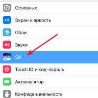 Voice assistant Siri from Apple Siri functions on iPhone 6s
 How to roll back to a previous version of iOS?
 Unlock iPad in four days